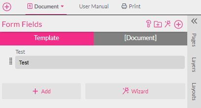
Form Fields are used wherever one needs to use user inputs or choices across several frames or documents. Form Fields can also be used to create nice looking user interfaces on the Buyer Side.
Before going in too deep, we recommend reading the general chapter about Styles and their best friends, Form Fields.
Tip: Form Fields can be copied over from a Template to a document (or vice versa) by selecting them and using either the context menu to copy and paste or simply pressing CTRL+C, CTRL+V.
There are two different kinds of Form Fields:
Template Form Fields are globally usable across all documents.
Document Form Fields are local and only usable within the current document. This is mandatory for Snippets or any documents which will be used as Sub Documents in Snippets.
Use the tab on the top to switch between Template and Document Form Fields. Document Form Fields will have the name of the current document in square brackets [DocumentName].
To create a new Form Field use the button. Enter a name for your Form Field but don’t worry, it can be changed at any point later on.
By default, the created Form Field will be a standard text input that will simply ask for a text on the Buyer Side. This can be changed in the Form Fields properties.
Form Fields can be sorted by clicking on the mover bar to the left and then dragged and dropped into place.
Form Fields can also be grouped, which will create a grouped configuration for the Buyer Side. New Form Field groups can be inserted by the Add Form Field Group button.
Notice: Global Form Fields will always be shown before local Form Fields within the same group.
You now can insert a Form Field as a Single Line text frame by simply dragging it onto a page.
Form Fields can also be easily created with the Wizard tool. This is a great way to explore different types of Form Fields and their uses!
Press the Style Wizard button on the toolbar or select the
icon inside of the Form Field tab to open the Wizard. Then select the Form Field Template you would like to insert and simply enter names for the Style and Form Field that the Wizard will create.
As the Wizard tool is callable from both the Style and Form Field resource tabs, it would also be helpful to read here about Styles, as well as how Styles and Form Fields can be used in conjunction with one another.
Form Fields can be used anywhere a text can be entered by using ${form.name}
where ‘name’ is the name of the Form Field.
Form Fields may also be used in Styles and therefore can be used as conditions for Styles. You can find a good example of conditional Styles used in conjunction with Form Fields in the Styles Wizard ‘Frame Position - Controlled by a Form Field’.
Form Fields can be pinned to a selected frame. That way they will only appear on the Buyer Side once the frame is selected. If the frame is a buyer step then it will also be zoomed to while editing. Clicking on the Pin icon shows the pinned frame/the first pinned document.
Form Fields may also be pinned to a document. This way they only appear when a specific document is edited by the buyer. Form Fields can be pinned to multiple documents.
See also: Steps Workflow in the Buyer Side chapter.
Especially for step interface Template purposes, it can be very useful to pin a Form Field to a document(s). So when the pinned document is shown, the Form Field is shown like always, but for all other documents the Form Field is not shown anymore. This allows for Form Fields which can be used in every document but will only be shown in a specific document/configuration step.
Click here to see Pin To Frame example in the Form Field & Styles Chapter.
Form Fields create a user interface for entering data with just the right UI elements.
To open the Form Field properties, select the Settings icon , right-click anywhere on the Form Field, or click to the left of a Form Field (besides the mover) to open the Context menu and select Properties.
The properties dialog opens:
Sets the name of the Form Field (except for auto-generated Form Fields where the name is fixed). The name has to be unique in its scope and can only contain characters and numbers without spaces. This name is used later on when addressing the Form Field in expressions.
This is the display name for the Form Field which is used in the Buyer Side interface.
This feature is used to display helpful text on the Buyer Side underneath the Form Field:
Info Icon
When a web link is entered into the Info Text box, an info icon will appear next to the Form Field label:
Selecting the info icon will open the web link in an overlay within the current browser window, and does not exit the Printess editor. Note that you must include the full link address (https://www.printess.com/) as shown in the example above.
Hyperlink and Text
If you would like to provide users with a link and text, simply add brackets to the text you wish to link and then parenthesis around the web link:
Note that you must include the full link address and no space between the brackets and parenthesis. You can hyperlink any text within the Info Text box with this same method.
The data type defines what type of data will be stored in the Form Field:
The Label data type also enables you to completely customize how information is presented. You can currently choose between 3 different sizes, 4 different colors (changable in your Account Theme + Logo Bootstrap Theme settings), and 6 different Info styles:
If Number was selected as the data type, the number type defines the type of number stored:
Defines if the Form Field should be visible on Buyer Side (default) or only in Designer Side.
Form Fields can be shown conditionally (conditional disclosure). This is useful in all situations where a specific option should only be shown to the Buyer if another Form Field has a certain value.
For example, you allow adding an envelope and the buyer to select the envelope color. Then the Form Field for the envelope color will be conditionally shown based on whether the envelope option was chosen.
The condition must be a valid JavaScript instruction returning a boolean value. One can use form, info, label, and data fields here. Result will give you an indication of the outcome where true means the Form Field will be shown and false means the Form Field will be hidden.
Edit Condition will open the Condition Editor which allows for easy creation and editing of the visibility rule.
Please read about the Condition Editor in the Styles chapter here.
Define the maximum characters a buyer can input. A warning message is shown once the buyer enters more than the predefined number of characters.
Defines if changing this Form Field is mandatory. A warning message is shown if the buyer does not change the Form Field. This lets you avoid example values getting into the ordered product.
The default content of this Form Field will be cleard when the buyer starts editing.
Enables the check against a predefined offensive word list (either supplied in the account preferences or supplied via API).
Price Relevant is an indicator to a connected e-commerce system that this Form Field represents a potential price change or option. This will not have any effects within the Editor, but it will trigger a callback in the frontend API to allow for price changes in the shop page when this Form Field is changed (e.g., for a product option).
Select-list, Image-list, and Color-list Form Fields can all be set to Price Relevant.
A coin icon will be shown on the Form Field to indicate if it has been set as Price Relevant:
This option force update of all editable doc thumbnails (only in conjunctions with live-update icon-mode) it will also indicates a long-running script or big visual change e.g. complete resize of a multipage document.
Control Groups allow to group Form Fields into one line. eg. to have a area code selection and a phone number in one line but still separated. Simply select one Control Group for several Form Fields. The Form Fields will then be shown in their order from left to right. You have up to 5 Control Groups available.
Tip You can make a grouped Form Field inside a group smaller by setting max characters. See this example where we set max characters of the area code to 5:
When using control groups in Single or Multi Line texts you can use the ${group._(x)} syntax to address a Form Field control group instead of concatenate all members. Additionally, this has the advantage that only the first control group members text-before and last control group members text-after will be used - and only if the entire group has a value.
Printess allows for easy digit grouping for phone numbers.
Digit grouping works best if you split up a phone number into its components like in the above control group example. So you should not try to format a complete number.
Digit grouping works with groups of characters and also define where characters which do not match the pattern are added (the *).
Try selecting some formats from the list and observe the outcome both for you current Form Field value and an example value.
Imagine you’d like to format a cell phone number in the pattern ‘111 22 333’ then the pattern of choice would be ‘### * ###’ which will first fill one pattern of three letters and then tries to create as many 3 letter pattern from the right as possible and put the remaining letters (up to 2) after the first three letter pattern which will give the desired output when ‘11122333’ is entered.
In our Business Card example, we use this feature in conjunction with a digit grouping control group to achieve a good user experience for entering a phone number.
Regular expressions can be input for textbox Form Fields to ensure that an entered string matches your product specifications.
The above example uses a regular expression (^[0-9]$)|(^[0-9][0-9]$) that only allows single- or double-digit numbers to be entered.
A custom regular expression warning message will be displayed below the text box on the Buyer Side when an entered text does not match your regular expression:
For more information on regular expressions or help with debugging, check out RegEx101.com
This defines how the Form Field will be presented:
A simple text field to enter text:
Additionally, one can set Text-Before and/or Text-After in the Form Field properties. This will add additional text before or after the entered text (but only if the textbox is not empty).
This can be very useful when, for example, you create a business card where a fax number can be entered. Text-Before will tell Printess to recognize when a number is entered to add the prefix (Fax: __).
If a number is not entered here, then the complete line will be omitted on the business card.
Notice: Within these fields one can also use special formatting options:
<w:styleName>Text with Style<w:> adds a character Style before the text and reverts it after the text. You can also let the style span the complete text by starting in the text before and putting the <w:> in the text after.
For Multi Line text, it is sometimes useful to use a paragraph Style.
<p:styleName>Text With Paragraph Style<p:>
A paragraph Style will create a new paragraph at the end of the paragraph <p:> and nothing can be added after it.
Additionally, one can insert special characters:
\t to insert a tab
\n to insert a newline
\f to create a formfeed which in the event of text overflow between frames means, “please continue in the next frame.”
A nice example of using Text-Before and Text-After is shown in our Business Card example. Please have a look at the “phone” Form Field in the linked Template.
The text area is meant for text input spanning several lines of text. It does not support Text-Before or Text-After.
The values will be presented as a drop-down list for the Buyer to choose from. Besides being able to define displayed values that are independent of the value returned, you can also define the images that will be displayed within the drop-down.
A select list is useful for letting a Buyer choose from different options. Besides the value, there are seven different elements that can be displayed for selection:
All elements can be used together or alone. This is an example of the Buyer Side view where all elements are used:
And these are the corresponding settings in the Form Field properties:
Select List Autocomplete
Using a Table Data Type with a Select List Form Field also enables force auto-complete on the Buyer Side. Do enable this feature, simply write a list with square brackets on each end to auto-complete what a Buyer types. This is very useful for Buyers to search through and select from large inventories.
Writing the same list without brackets will give a drop-down menu for Buyers to select from, this is the default:
This is a Select List Form Field that displays additional information on the Buyer Side.
This Form Field User Interface displays the information from the Select List Info column underneath the Value and Image information for each row on the Buyer Side selection drop down menu:
The values are represented by images. Image appearance, selection, and hoover state are configurable via standard CSS properties. The image must have been previously uploaded in the Images tab.
The image-list type is made for all options where every value is represented by an image. All options are shown together and it features a CSS controllable appearance and hover effect.
The label text will be used as a tool-tip when hovering over an image, the info text content will not be used.
The List Image Width and Height properties define the box (in pixels) that the image will be proportionally scaled into.
Notice: Besides using ${form.name}, one can also use ${label.name} and ${info.name}. With the help of a Style ${image.name} can directly assign an image used in a Form Field to a frame by assigning it to the image property in the Style. A good example of this is the demo document T-Shirt Configurator, where the T-Shirt image is directly taken from the Form Field’s image value.
List filtering is super handy when you’d like to filter a select-list, image-list or color-list by a category. The values used to filter down the list must be entered into the info column or into one of the meta columns. You can also put multiple values in one column by just separating them by comma.
To enable filtering, select a second Form Field containing the categories (in the value field) for the column with the corresponding values.
All rows that are matching the current conditions are highlighted in green. Note that this filtering will only be in effect on Buyer Side.
Once a new category is selected in the Category Form Field, Printess will make sure that the filtered Form Field will shows a valid value. If there is more than one filter applied, it will only show entries valid for all filters.
You can use Write to Second Form Field to write the content of either the value, label, info, tag or meta (1-3) field of your list to another Form Field (into the value). You can write content to up to four Form Fields.
In this example we fill the text type Form Field ‘Title’ with the value of the product list e.g. Cheese Burger to let the Buyer edit the title on the Buyer Side without changing the value in the product list.
Write to Second Form Field can also be used without filtering.
Try list filtering and write to other form field yourself with our tutorial template “List-Filtering”. Listed in the new tab**
Please have look into our Menu Card example and try it yourself.
If the data type of a Form Field is set to Table, the Buyer Side will show a table editor where the Buyer can enter data and add or delete rows.
To create a data table choose Table as the data type and then define the number of columns and their edit options in the Form Field’s properties.
For each column you can define:
The row column is used to numerically define rows such as type and price as in the example above. This will display both rows as a single row that lists, for example, a pizza and its price. Multiple rows can be assigned in this way.
Rows are also sortable on the Buyer Side. Buyers can add, delete, and rearrange their data table entries. Buyers rearrange rows in the Form Field by simply selecting the table header badge or manually drag-dropping the rows to their desired position:
Once the columns of the table are defined one can add default values by closing the properties dialog and pressing the + on the top-left of the table then entering values into the newly created row(s). Once finished entering the default values, press the Apply button below the table.
Internally the values of a table are represented as an array of row objects and their named properties. One can also export and import the values in a table as a JSON string via the context menu of the Form Field.
Select Copy JSON and the content of the table will be copied to the clipboard in JSON format. The above table will look like this:
[{"event":"Holiday","text":"New Year's Day","day":3,"month":1},{"event":"Holiday","text":"Good Friday","day":15,"month":3},{"event":"Holiday","text":"Easter Monday","day":18,"month":4},{"event":"Holiday","text":"Early May Bank Holiday","day":2,"month":5},{"event":"Holiday","text":"Spring Bank Holiday","day":2,"month":6},{"event":"Holiday","text":"Boxing Day","day":26,"month":12},{"event":"Holiday","text":"Christmas Day","day":27,"month":12},{"event":"Birthday","text":"Peter Müller Birthday","day":26,"month":12},{"event":"Birthday","text":"Gabi's Birthday","day":1,"month":1},{"event":"Birthday","text":"Hans' Birthday","day":4,"month":1}]
Now the table contents can be edited and (by selecting Paste JSON) copied back into the table. Note that if one adds a property in the table which currently has no column, the table control will not display it until you add the respective column.
Tip: One can use the Table Form Field to store structured data for use in the document without showing it to the buyer by switching the visibility to Designer Side.
Please read more about tables and the use of scripting in the scripting section.
The color-list user interface allows for a simple color selection on the Buyer Side.
By entering a Hex RGB color value in the value column, the color-list displays a color patch with this color to the buyer.
If you want to set colors with a Form Field you can either use the value directly in a Style’s color property or if you need to address named Spot or CMYK colors use the label or info column to do so.
On the Buyer Side, a color selection with color patches is shown below. The size of the color patch can be controlled with the List Image Width and Height properties.
The Image-ID Form Field can be used in all situations where you would like to let the buyer choose one image and distribute it across multiple image frames in one or many documents. That’s why you need to also define the default image size and aspect ratio in pixels.
With this information, Printess will automatically show a matching crop option whenever the buyer uploads an image. It is also possible to disable cropping in the Image-ID properties.
Tip: To get a working example one can also use the Style Wizard. Press on top of the Styles tab and choose Image Frame Linked to ‘image-id’ Form-Field. This will create a frame with the connected Style and Image-ID Form Field.
Read More about the Style Wizard here.
To use the Image-ID Form Field one needs to define a Style that is assigned to the image. Then this style can be assigned to all frames which should show the uploaded image.
.ffImage {
image:${form.Image};
}
The checkbox Form Field exposes a table with only two values: True and False.
The Label, Image, and Tag columns can be set to any value. But it is important to note that the checkbox Form Field will remain as a String type (as it is not a real boolean T/F value).
Auto-generated Form Fields are a handy way to expose content when Sub Documents are used on the Buyer Side. Sub Documents may be placed several times in one document and every occurrence needs to be configured with its own Form Field.
Some functionalities are only available with auto-generated Form Fields:
If a color scheme is available (at least one color exists two times with the same name in different color groups), Printess will automatically generate a Template-wide Form Field that is used to easily control color scheme selection.
Color groups in the Colors tab:
The respective Auto-Generated color scheme in the Form Field tab:
Learn more about Color Schemes here.
Tip: You can easily change visibility of the Form Field on Designer Side when a color scheme is to be controlled via user interface buttons. This is done through the color scheme properties:
Click here to learn more about Buyer Side user interface elements.
The Matrix Product feature is ideal if you would like to present multiple configuration options for a product with side effects e.g., a different artwork area or a different product image.
Whenever a Matrix Product is configured, a Form Field with the product choice is created. The properties of the Form Field can be edited as with all other Form Fields (but it must remain a list type).
Matrix Products can be configured via enabling Show Layer Matrix in the Settings menu on the right of the top menu bar.
This will show the matrix table at the bottom of the window:
Within this table one can add additional rows by pressing the + button and entering a selection value. The trashcan icon can be used to delete a row.
The Matrix Product is a powerful way to control visible layers by product selection. The controlled layers can be from any document within the Template. This also makes it possible to control layers of contained Sub Documents.
If you’d like to add a layer of a document to be switched by the Matrix Product, switch to the document and then select the layer to be controlled by clicking on the triangle beside the Visible Layers headline. Here you can select the layer and a new column will be added to the Matrix Product.
Now one can switch all layers within a row to either visible or invisible with the eye icon in each column.
The example Sign Template contains a great workthrough of what is possible with a Matrix Product.
This example contains multiple product options which are controlled by enabling or disabling layers. Not all options are available for different sign materials - but with the Matrix Product this is easy to implement!
The product options are visualized via Sub Documents that have multiple spreads and a Form Field to select them. In the below example, it is the Sub Document containing the drill holes for the sign which is placed on a layer called HOLES. When HOLES layer visibility is changed in the Matrix Product table, the corresponding drop-down will appear or disappear:
A special Form Field type is the DOCUMENT_SIZE auto-generated Form Field, which controls the size of the actual document. To enable it, right-click on the document for which you’d like to enable size control and select Get Size from Form Field:
If it does not already exist, Printess creates a Template Form Field named DOCUMENT_SIZE and a select-list or image-list with all available document sizes to choose from. By default, the size of the actual document is added as the first list entry. In the values column, one must enter simple value combinations of width x height (e.g., 22x29.7). Now whenever this Form Field is changed, the document size will adjust accordingly.
Notice: The values in the list are always interpreted with the setup document unit.
If several identically sized entries are necessary for a configuration, you need to add letters at the end. For example “10x21a” and “10x21b” will result in the two documents of the same size, but each retains a unique key which is necessary for a select list.
Notice: There can only be one Template-wide document size Form Field which will change the size of all documents when Get Size from Form Field is enabled.
Please also read our chapter on the superpowers of Flex-Designs here.
You can use the Write to Second Form Field option in a Form Field properties menu to allow Buyers to indivudually set the document height and width by selecting the DOCUMENT_SIZE (WIDTH) or DOCUMENT_SIZE (HEIGHT) values:
This is a great feature for posters and signs where a Buyer can choose the exact dimensions they want for their product. It will present a drop-down menu on the Buyer Side for the document size values selected in the Write to Second Form Field settings. The Buyer Side example below uses a DOCUMENT_SIZE Form Field in conjunction with the DOCUMENT_SIZE (HEIGHT) and DOCUMENT_SIZE (WIDTH) values that write the selected values to a second Form Field when changed. This allows the customer to select from 3 preset dimensions (from the DOCUMENT_SIZE Form Field) or to easily customize their height and width dimensions.
Seperate placement margins for each document size can also be set in the auto-generated Document Size Form Field properties window. This is done in the value column:
The syntax for setting document size placement margins is a # followed by the margins (top, right, bottom, left). So for a 10% placement margin you would enter the document size (ex. 20x20) followed by #10% 10% 10% 10%:
Layer Visibility can be controlled by an auto-generated Form Field. For this one needs to enable Show as Form Field in the Layers Context menu. A new Form Field will appear in the document’s Form Fields. Please also see the layer resources chapter.
The selected spread (the page) of a Sub Document can be controlled with a Form Field. Enable Show Spread as Form Field in the Sub Document feature tab. Please read the chapter on Sub Document frame features.
When working with Snippets be aware that all Form Fields and Styles will not be imported into the document where they are inserted. So instead of using Form Fields, one should use the Buyer Side configuration options for frames. In the case of Layout Snippets, you may want to add groups to group frames and their configurations.
Another possible concept is to have the Form Field in the document where the Snippets are inserted and all the other Snippets will ‘listen’ to this Form Field (e.g., called ‘name’). This method lets one quickly and easily create prefilled Snippets.